
You know that expression—You can’t judge a book by its cover. Well, I agree with that. I’ve never bought a book based upon what the cover looks like. To me, the title of the book is more important; further, I tend to read non-fiction. As much as e-books, regardless of platform, are a great idea what with all the devices and e-Readers these days, I’d still prefer a paperback or hardcover book. And I am not the only one who thinks this way, as I recently sold a paperback of my trilogy to a neighbor who preferred actual books over e-books. And another thing: an e-book I purchased from Amazon a couple of years ago on the history and doctrines of Scientology (for research purposes) suddenly disappeared one day from my Kindle App! But hard copies can last forever, soooo…
Anyway, onto how I designed all of my novel covers.
First, Battle of the Band, the cover of which (as with the other covers) are shown on the right side of the page. When figuring out the cost of putting various cover designs into the printing of my first novel, the printing company (I forget the name of it) cover cost would be cost-effective for me if I only used one color along with black and white. The cover being white and the printing of the subtitle and author name in black, and considering the title Battle of the Band would look more like a ‘battle’ (a spiritual one) if the title was ‘written in blood’ so to speak, I chose red to be the third color. And, as well as I could using a Paint-type application on the Macintosh computer I typed the original manuscript onto, the title looked as if it was indeed written ‘in blood.’ Further, I wanted a facsimile to the Corion-cross symbol within the novel that was also featured within the symbols listed in ClarisWorks software (Mac’s then-featured software that compares to MS Word or Corel Word Perfect), so I used a rose-shaped ‘cross’ for my symbol and added what looked like snakes onto the cross, with the snakes in red ink as well. So, the cover is black and red on white, which is the only type of cover I could afford to have printed at the time. Folks, printing fancy covers with lots of shades and colors is not cheap, even for e-books, if you want covers that truly look professional. Mine looked as ‘professional’ as I could afford! BTW: I did attend a year of art school in NYC in 1970-71.
Then, The Prophesied Band, using the same colors black and red on white, as can be seen at the right side. I probably could have done a better job writing or ‘painting’ in red the words The Prophesied Band, but to make up for that I added an actual cross denoting the type of cross used to denote a ‘Christ on the Cross’ meme with a necklace-chain type setting attached to it. When I finished this second novel in the trilogy—and I knew then, in 1998, it would become a trilogy—I knew that the ‘mission of God’ that ended the novel would imply a connection to Christ, somehow. After all, at the end of this novel the Creator’s angels, the Tooters, were messaging the band members that telling about accepting Christ to specific groups of people were their missions. So, putting a Christ-cross on the cover made sense. Again, a ClarisWorks cross symbol was used.
Then, The Prodigal Band. Within this novel a song performed at a music festival in 2000 mentioned the star cluster known as Pleiades, which it turns out is within the Taurus Constellation (I had thought it was within the Dragon Constellation, Draco), but can be seen in the night sky as within the view of the Dragon Constellation (either behind it or ahead of it). The photo from a copyright-free photo site, Pexels, was used for the cover, seen to the right of this post. Again, black printing on white cover was used along with the copyright-free photo.
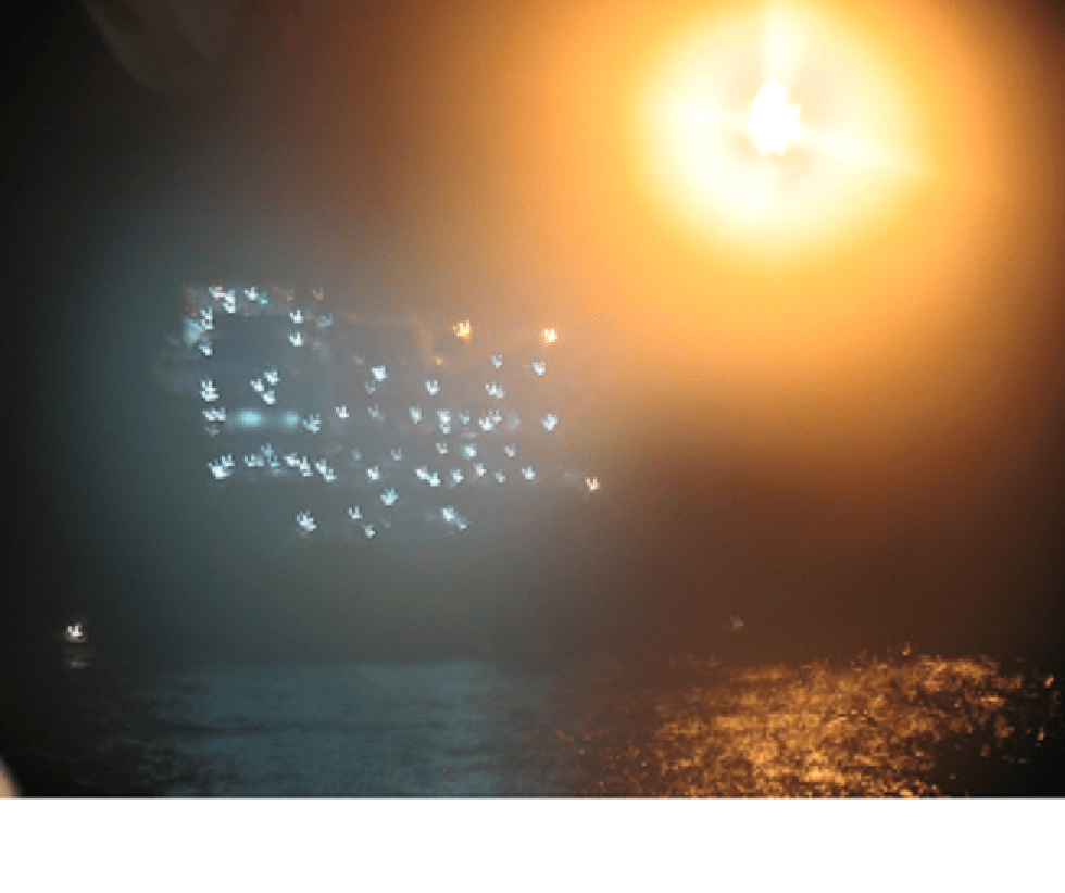
Finally, The Prodigal Band Trilogy three-books-in-one published By Lulu Publishing. Instead of using a simple three-or-four color cover similar in simplicity with the others, by then I had built up a picture-photo set from single-use cameras, having the photos transferred to a digital form.
Note: I do not have a cell phone, thus, I cannot take digital photos using one! I have enough devices if you know what I mean…
And choosing the photo for this cover was easy, because the photo shows a glowing firework that looks like a shining sun that has a light-cross figure within it, water beneath the ‘sun’ and glowing fireworks to the side of it, which is the best photo I had to express the spiritual glow of salvation my novels promote. The photo was taken on July 4th, 2009, at night at SeaWorld in San Antonio, Texas, where my family and I visited returning from a fishing trip off the Texas Gulf Coast. This photo (as well as book cover), BTW, is copyrighted, © 2009 by Deborah Lagarde, All Rights Reserved. The complete photo is at the top of this post while the novel cover is based on it, clipped to size using the Microsoft Paint software feature, a PNG file.
Use the menu above to purchase books at the Bookstore link or to download the FREE PDF The Prodigal Band. There is also a newly added link to view Snippet Posts and posts about the novel characters.
Cover Art: Photo of night fireworks at Sea World, summer, 2009, by Deborah Lagarde. © 2009 by Deborah Lagarde. All Rights Reserved.
The Prodigal Band Trilogy © 2019 by Deborah Lagarde, Battle of the Band © 1996 by Deborah Lagarde, The Prophesied Band © 1998 by Deborah Lagarde and The Prodigal Band © 2018 by Deborah Lagarde. Permission needed to copy any materials off this page.
